BOOK DESIGN
It’s been a ride and a half getting the manuscript to the point where Gary, my book designer, can start laying out the pages. By my count, I’ve pressed the send button for the final time three times now. Once to the Dominic, the editor. Once to add more photos. Once to incorporate all the “front matter”: preface, introduction, publisher’s message, endorsements.
This is the process of refinement that gives a book its final polish. As I write this, Gary has done a preliminary layout and in doing that, has read the text through again. He says he can’t help it, especially with a book so interesting,which is high praise from a man who’s already read it twice. I’m busy responding to his questions and suggestions. Meanwhile, editor Dominic has also reviewed the manuscript once more and provided some suggested tweaks to Patrick, the publisher, who is giving the text a thorough read himself. This book will shine diamond-bright from all the polishing!
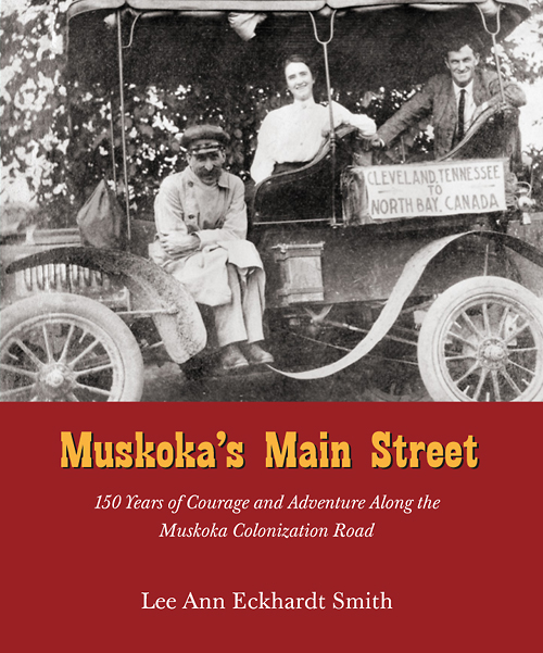
What you will be dazzled by first, though, is the design. Main Street has so much visual appeal, starting with the cover:

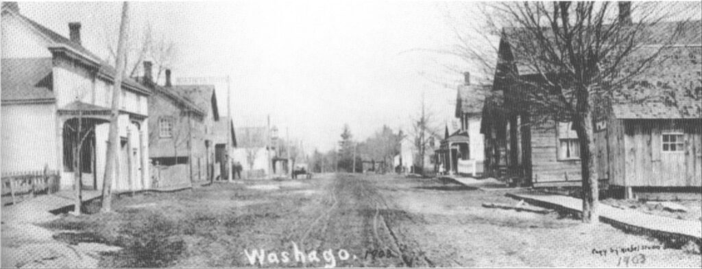
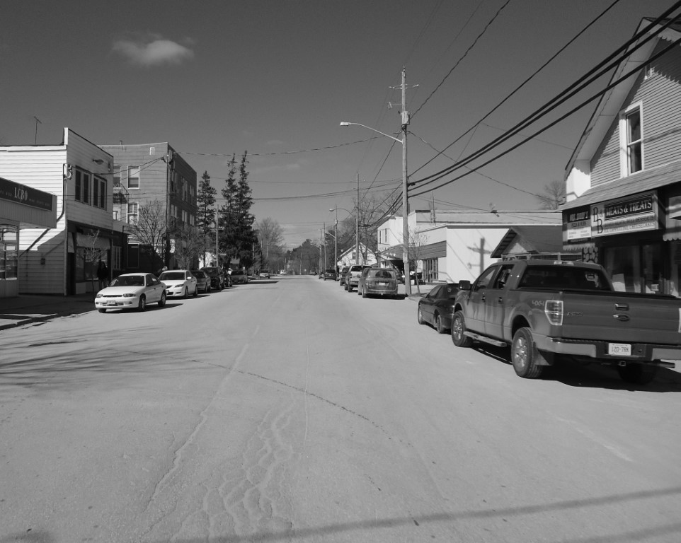
Inside, this is not a simple novel, which consists of page after page of plain text with a header, a footer and some chapter pages. Main Street has over a dozen “sidebars”and 100-plus photos and maps that must be fit into the right places in the text, enhancing not distracting from the text itself. Every single page is unique, yet follows an overall design that dictates column width, text placement and presentation.
Book design is both creative and technical; every element requires a decision. Fonts are chosen for readability and for a style that reflects the nature of the book. Page size and paper type are based on the content, the number and size of illustrations, and the cost of printing. Muskoka’s Main Street will be seven by nine inches, printed on high quality white paper, and will run about 230 pages.
Every page will sparkle!


